The Power Of Color Theory
Coca-cola. McDonald’s. Nike. Starbucks. Apple. These are some of the most recognized brands worldwide. Their
logo designs are one-of-a-kind. But beyond that, their colors are iconic and contribute to their recognition.
Color is an extremely valuable and hugely underrated tool for every organization. Here’s why:
People tend to associate different things with certain colors. Take green for an example. Green has been associated with money for as long as dollar bills have been green. Other colors can evoke certain emotions as well. In fact, the two are so closely tied together that we sometimes use colors to describe our feelings. Remember the phrases, “feeling blue,” “green with envy” or “seeing red?” Because of common associations to colors like these, using color correctly can make or break a brand’s marketing.
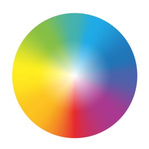 What Messages Do Colors Send?
Whether or not you own a brand, paying attention to colors in marketing can tell you a lot. How do you want your brand to communicate with others? How are other brands communicating to you?

Purple was once a symbol of royalty and power. A rich purple doesn’t occur in nature very often, so purple dye was rare and expensive. Only the wealthy could afford purple clothes. It is regal, mysterious and sophisticated. Using purple in your business can create the impression that your brand is wise, reputable, or imaginative.

Blue is a calming color because of it’s association with the ocean and the sky. It’s trustworthy, secure and responsible. Because of this, blue is often used in places like counseling centers and doctor’s offices to add a calming mood for their patients to counteract any distress or worries that brought them there in the first place.

Green is interesting because it can be associated with a lot of different things. It is very dependent on the shade, too. For instance, a deep green is often tied to nature, a middle green is a symbol of money and light green is calming and evokes feelings similar to blue. Because of this, green is used in a variety of trades, such as entertainment, food and drink, energy and so on. Since being eco-friendly became rising trend, green has become the poster child for this and is now also being associated with being clean or without harmful ingredients or practices. Hence the term, “going green.”

Yellow is the color of the sun, so it’s energetic, full of life and it exudes positivity. It is definitely an attention-grabbing color because of the brightness, and it can even boost energy and creativity. Because of the lightness of this color, yellow is usually paired with another hue, such as black or red, to add enough contrast to a logo so that it can be seen from far away.

Red is passionate. Studies have shown that viewing the color increases your heart rate and makes you breathe more rapidly. It is aggressive, energetic and powerful, and it demands your attention. It is also associated with blood, and therefore vitality and the necessity to maintain health. Because of this, red is used relentlessly by restaurants and fast food chains to encourage customers to make business with them.

Orange has associations somewhere between yellow and red. It is enthusiastic and playful like yellow, but it commands vitality, boldness, and determination like red. Similar to green, orange can also be used in a variety of brands very successfully.

Brown has a wider range of associations like green. It is earthy, natural and simple, but also strong and dependable. Brown is often used with brands that want to be seen as old fashioned or traditional. Things like brown paper bags, faded or vintage paper, and wood often reaffirm those moods in a brand location, products or ads. Brown can also be used to tell audiences that their brand is eco-friendly or natural, especially if paired with green.

Black was used in all logos before
color printing was invented, so it has a sense of timelessness and prestige. It’s also associated with luxury, boldness and value. Simply put, it’s classy. This works very well with brands that want to be thought of as suave, high-end or bold.
Preferences in Gender

Successful branding always knows its target audience—the people that will not only be the most interested in the brand, but also the audience the brand connects best with. These are the people businesses will receive the most business from. This is very important for brands that connect best with a certain gender. To illustrate this point, take a look at a toy store. What colors are used to advertise to young girls? Which colors are used in products made for young boys? What colors are used for toys that are meant for both boys and girls?
The same concept stands for both men and women, even if they have outgrown their favorite colors of blue or pink. Though men and women on a basic level will usually make the same associations with colors, it is important to make a point of letting others know if a business connects best with just one gender.
Cultural Implications
If your organization is international, you have to keep in mind that different cultures place value on different things. While a lot of implications are universal, each culture associates colors in their own way.
Keep these cultural differences in mind when designing your logo, but make sure yours is communicating the right message. This can be done by pairing your color of choice with contextual elements so it translates better. For instance, if you want your green logo to be associated with nature and not money, consider incorporating the shape of a tree or mountain into your logo.
Though there are so many other factors that make a difference in
marketing and branding, color is overarching and ever-present. It sets a mood and tells an audience what to think about the brand. Talk with one of our branding experts at
AlphaGraphics so we can help your brand speak the way your want your brand perceived.
Contact us today to set an appointment.