Serif or Not to Serif, that is the Question.
Designers love to be picky about their favorite fonts. Every one of us has that list of 5-10 typefaces we gravitate towards when we're given carte blanche. Even if Gotham wasn't our official AlphaGraphics font, I think it would be on my list.
There are several classifications of fonts, but not everyone knows what we're talking about when we say "serif or sans-serif", not to mention when we go even further into typography terms like leading and kerning (that's a subject for a later newsletter!). There are so many fonts available on the market today that it can be a little overwhelming if you don't know where to start - so let's go over the basic categories first, and then break them down from there:
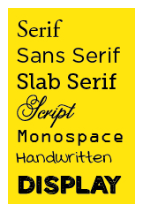
SERIF
Serif fonts like Times New Roman, Garamond and Caslon have a small tail at the top and bottom of straight letters, and on the ends of curves in capitals like "S" and "C". They're usually softened and slightly rounded, and are great for professional or elegant uses.
SANS SERIF
Sans Serif fonts like Helvetica, Gotham and Calibri don't have any ornamentation to their ends or edges. There are a wide variety of sans serif fonts that have their own sub categories, with styles ranging from classic, casual, technical, industrial or retro.
SLAB SERIF
Slab serif is technically a sub category of serifs, but in this case, the serifs are flat and generally the same thickness as the rest of the letter. American Typewriter, Rockwell, and Museo Slab are good examples.
SCRIPT
Script fonts can range from the ultra classic and elegant to the more hand-drawn calligraphic fonts that have become widely popular on Pinterest and Instagram. Scripts often come with a variety of alternates that have different ornamentation or "swashes" to allow you to customize a headline or graphic for spacing and emphasis.
MONOSPACE
Monospace fonts were designed for technical applications. Most fonts allow for variations in spacing for "I"s and "M"s and other such letters, but monospace fonts were designed to give all letterforms uniform spacing. Most monospace fonts are recreations of fonts designed for typewriters or tecnical programs, like Courier or OCR.
HANDWRITTEN
I like making Handwriting a separate category (as it's defined in Adobe Typekit) because not every script is handwritten, and visa versa. Handwritten fonts are an equally diverse category, from childish to casual or calligraphic scripts.
DISPLAY
Display fonts is pretty much the miscellaneous category for everything that doesn't fit into the other five. Typically these are your novelty typefaces that have limited uses, but also include things like dingbat or ornament fonts that include pictographic characters for icons, symbols and other uses.