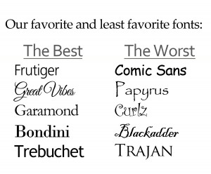
There have been volumes (literally) written about how typeface can impact everything from web posts to printed books. The right font can increase legibility and credibility. The wrong font can make a project look amateurish and render it almost impossible to read.
By now, almost everyone knows that Comic Sans is NOT the font to use for anything (except, on the rarest occasion, a child’s birthday invitation). And, aside from its questionable use for the title of the film Avatar, the font Papyrus is best left for use in the most mundane church bulletin.
Almost every designer has a “hit” list of the fonts that prove to be consistently easy to read. Others can rattle off a top 10 list of fonts that they would never, ever consider using.
There are rules, of course, for what fonts to use for titles, for text, for web use and for different kinds of printed pieces. There are principles for the use of serif and san serif fonts, for when to use italics and when to use bold face.
There are also rules for when to break the rules.
We’ve curated our own list of sites that provide the best (and worst) information about the selection and use of typeface. Some of these are useful. Some of these are fun. All of them provide great information that can help you avoid an unforgiveable font faux pas.
11 Fonts That Designers Love to Hate
Examples of How a Bad Typeface Can Run Your Brand
What Font Should I Use? Five Principles for Choosing and Using Typefaces
Sources for free fonts:
