So you submitted a job to a print shop and when it was delivered you discovered, to your dismay, that the physical print colors do not match what was displayed on your screen. What went wrong? Much of the blame for print color confusion lies in the comparing of on-screen color (the colors displayed on your computer monitor) versus print. So, how do you calibrate color for print? Never fear, we've got a helpful break down for you, providing solutions to the two biggest color questions we address here at our
Alphagraphics Minneapolis and
Alphagraphics Apple Valley locations.
How Do I Make My Screen Look More Like the Prints You Make?
Calibrate Your Monitor. To get more accurate on screen color, you should consider a monitor calibrator, such as the Eye-One Display or Huey. These monitor calibrators can be found in many online stores or at RP Imaging
http://www.rpimaging.com/store/CID86.
 Office Users - Don’t Expect RGB Colors to Print! Because your monitor has a greater ability to show you a wider range of colors than what is possible in printing, you shouldn’t count on the bright RGB colors to be replicated in print. Office applications are also very limited in their ability to display colors accurately on screen. The same object placed in Powerpoint can look different placed in Word. Office applications are not truly color-managed.
 Adobe Users - Use Proof Setup.
 Make use of the built in proofing ability of Creative Suite. Once you’ve calibrated your monitor, go to: View> Proof Setup> Customize.
Select the press profile your printer uses as its CMYK standard. At AlphaGraphics Minneapolis and Alphagraphics Apple Valley, we use the GRACol2006_Coated1v2 CMYK press profile for on screen viewing. Download the Press Profiles for your Mac or PC at:
http://www.gracol.com/resources/iccacc.
Why Did My Color Come Out Like This?
 Use EPS or Vector Files.
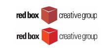
 If your logo comes out looking either soft, jagged or with a color issue, you should not use a JPEG, GIF or other compressed web graphic for your logo when you build your print layout.
Use only EPS, Illustrator or EWM files for your logo. These files are built using a formula to create the color and shapes. They can be resized and still retain their quality. If you are unsure of what these file types are, talk to one of our
Graphic Design Specialists at our
Minneapolis or
Apple Valley print services locations. They may be able to create one for you.
RGB Colors On Screen Are Different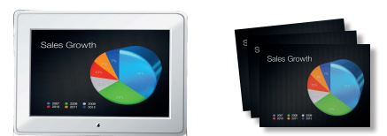 The color that is displayed on your computer monitor is in the RGB color space. Four color printers use CMYK inks to approximate what you see on screen from your documents. Because of the difference, your screen colors show differently than the printed version, especially in terms of bright colors.
If you have used extremely bright blue or green colors, those most likely won’t print as they displayed on your screen. You can ask an AlphaGraphics Minneapolis or Alphagraphic Apple Valley associate to give you a swatch print from a Powerpoint or Word document and the document it self, then you can build your graphics colors based on the print out.
RGB in Creative Suite
Another aspect to be aware of is when you build an element or text color with RGB colorants. The Creative Suite allows you to design in either RGB or CMYK. The advantage of designing in RGB is that the content can be re-purposed to the web with greater ease. Just be aware that if you intend to use RGB designed content for print, you may need to adjust your colors for the CMYK print process. Using a calibrated monitor and the Proof Setup view mode can aid in you in displaying on screen colors that look closer to the output we provide.
The color that is displayed on your computer monitor is in the RGB color space. Four color printers use CMYK inks to approximate what you see on screen from your documents. Because of the difference, your screen colors show differently than the printed version, especially in terms of bright colors.
If you have used extremely bright blue or green colors, those most likely won’t print as they displayed on your screen. You can ask an AlphaGraphics Minneapolis or Alphagraphic Apple Valley associate to give you a swatch print from a Powerpoint or Word document and the document it self, then you can build your graphics colors based on the print out.
RGB in Creative Suite
Another aspect to be aware of is when you build an element or text color with RGB colorants. The Creative Suite allows you to design in either RGB or CMYK. The advantage of designing in RGB is that the content can be re-purposed to the web with greater ease. Just be aware that if you intend to use RGB designed content for print, you may need to adjust your colors for the CMYK print process. Using a calibrated monitor and the Proof Setup view mode can aid in you in displaying on screen colors that look closer to the output we provide.
Accurate Color Printing Services in Minneapolis and Apple Valley
At our two AlphaGraphics locations, AlphaGraphics Minneapolis and AlphaGraphics Apple Valley, we never want our clients to experience the unfortunate surprise of print results that don't match what they envisioned. Whether we are printing
banners,
business cards,
wall graphics,
letterhead or other materials, we build many checks into our printing process calibrate color for print and ensure that the final results match our client's vision. What's more, we're always updating with the newest technology. We just added a new digital printer with capabilities that allow us to store color settings for printing across multiple mediums. Spot on brand colors 100% of the time! Contact
Alphagraphics Minneapolis or
Alphagraphics Apple Valley for your next print job - we'll ensure there are no color surprises at the end of the print rainbow!