In honor of Valentine's Day, I thought we could take look at the "heart" of Graphic Design.
The heart of any creative endeavor lies in the emotions that you provoke in the viewer. Your target audience engages with your design (or painting / sculpture / prose / whatever!) with their feelings, and the more you make them feel, the more memorable - and therefore effective - your work will be. The stronger a viewer connects to your piece on an emotional level, the more likely they are to select your work over another when making their initial selection and to have brand loyalty in the future. But how do you infuse feeling into a piece without it being "too much"? How do you convey an abstract idea like trustworthiness in a simplified form, like a logo?
The answer lies in the psychology of color.
Whether you are aware of it or not, society has largely formed how you think about colors. Each one creates a different feeling or emotion and can draw or repel the viewer. Some of the things we feel when we look at colors come from personal experiences, others from underlying instinctual psychology. By tapping into pre-established feelings subconsciously related to color, a designer/artist an edge to help the viewer connect emotionally to your piece.
Although every nationality or culture group may associate different meaning to the colors, here is an infographic resource that you can use to help you put pre-established emotions into your design using basic color theory.
[caption id="attachment_83" align="aligncenter" width="940"]
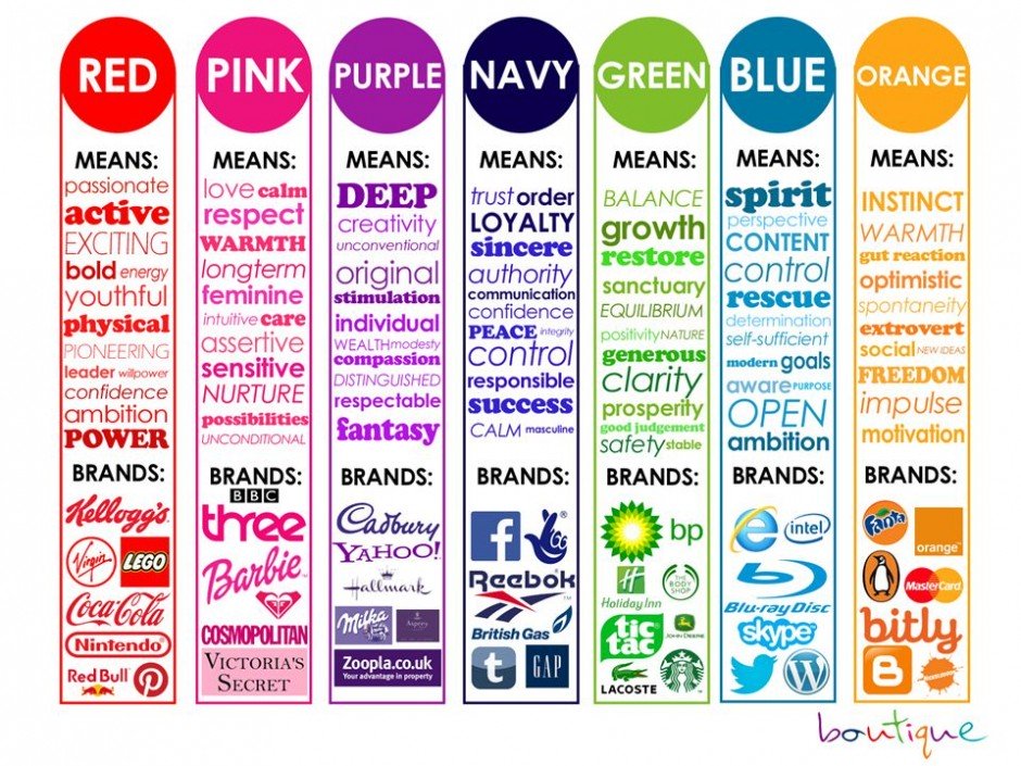
Source: https://www.designcontest.com/blog/emotional-design/[/caption]