Screen Color vs Printed Color
Have you ever completed a project and felt that sense of excitement before bringing it to life in print?
Have you ever been disappointed because the colors don’t quite match, ruining the entire look you were going for?
Don’t worry, we have, too, and it’s an extremely frustrating issue. Despite that frustration, we are happy to report that here at
AlphaGraphics Rexburg we are experts in this area, so we know how to help you get the best results possible.
First, let’s cover the basics.
Why do colors look different on your screen than in print? Well, there are a lot of different factors.
Screen Brightness
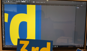
The simplest factor is screen brightness. When people are in the process of creating designs or editing photos, they tend to turn their screen brightness all the way up. While this is helpful in the design process, it isn’t a true representation of the colors they are using or the brightness of paper. (Not to mention, the strain on their eyes!)
Luminosity
Next, we have to consider where the light is coming from. Computer screens create their own light, and printed materials are simply reflecting light. There is no way to make luminous colors on your screen look the same as non-luminous colors in print.
Color Composition
When learning about color composition, you must keep in mind that black and white are not really colors. White is a combination of all colors, while black is the absence of color all together.
The colors on your screen are created combining three colors of light: red, green and blue (RGB). RGB is an additive color model. This means that the three colors of light can be added together to create colors. If they are all added equally, you will end up with white.
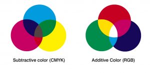
Printed colors, however, are created using a combination of four colors: cyan, magenta, yellow and black (CMYK). CMYK is a subtractive color model, which means that as you add more of each of the four colors, the developing color gets closer to black.
Now that you know why the colors look different, let’s focus on your options for adjusting. Unfortunately, the luminosity and color composition factors are unavoidable. Luckily for you, there are a few other simple fixes.
Turn the brightness down
First, try turning your screen brightness down when editing photos or creating designs. Each screen is unique, so there is no guaranteed brightness to match colors, but we recommend keeping your screen set to around 50%. A slightly dimmer screen will display your images a little closer to the printed result.
Always test print!
Before printing your total quantity, print out one piece at a time. Evaluate the colors after each test and adjust accordingly on your document.
Here at
AlphaGraphics Rexburg, our computers are calibrated to display colors as close to the printed versions as possible. On top of that, we will help you test print and provide guidance in adjusting your document. We will always check with you before printing the final quantity to make sure everything is perfect.
Now that you’re armed with knowledge and guidance, go forward and print with confidence in your color choices!
Getting Started
Call us at (208) 356-0170 or request a quote below to get started today!
[wpforms id="340" title="true"]